
When I started McQuaid & Company, I knew we needed something to make us stand out in a sea of real estate signs. I could have played it safe with the typical blues and grays you see everywhere in real estate. But here’s what I’ve learned in my journey from startup to success: playing it safe is the riskiest move you can make!
That’s why I went ALL IN on red. Bold, energetic, memorable red. Was it different? Absolutely! Did some people question it? You bet! Did it work? Let me tell you a story…
During one of our innovative open houses (you might remember the safari one I’ve told you about in The INth Degree!), a client pulled me aside and said, “I’ve seen your red signs all over Naples. Before I even knew your company’s name, I knew those red signs meant something special was happening.” That’s exactly what I was going for! Our signature red has become as recognizable in Naples as our beautiful palm trees.
But color isn’t just about standing out – it’s about speaking directly to your customer’s heart and mind. Did you know that 85% of consumers cite color as their primary reason for buying a particular product? That’s not a typo – 85%! Color isn’t just part of your brand; it’s your silent salesperson working 24/7 to tell your story.
The Psychology Behind Color Impact
Let me share something fascinating: our brains process color before anything else. Research shows that people make up their minds about a product within 90 seconds of seeing it, and up to 90% of that assessment is based on color alone. Think about that! Before your potential customer reads a single word of your carefully crafted message, their brain has already made decisions based on your colors.
Let me share what I’ve learned about the emotional power of colors:
Red (Our signature color!):
- Creates immediate energy
- Triggers excitement
- Increases enthusiasm Think about it – when you see a red sign in front of a house, don’t you want to know what’s special about that property?
Blue:
- Builds trust
- Promotes calmness
- Perfect for financial services This is why you see so many banks using blue – but that’s exactly why we didn’t!
Green:
- Represents growth and prosperity
- Connects with nature
- Perfect for health and wellness brands We see this a lot in our Naples market, especially with businesses trying to connect with our natural paradise.
Creating Your Color Strategy
Here’s my secret sauce for choosing your brand colors:
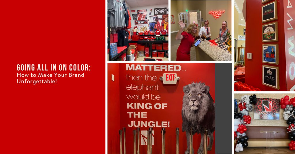
- Be Authentically You: Your colors should reflect your company’s personality. At McQuaid & Company, we’re bold, energetic, and passionate about serving our community. Red perfectly captures that spirit! When we recently hosted our community events at Bayfront, our red branding created an instant recognition factor that drew people in.
- Stand Out in Your Industry: Look at what everyone else is doing – then dare to be different. When every other real estate sign was blue or green, our red signs became landmarks. I can’t tell you how many times clients have told us they found their dream home because our red sign caught their eye!
- Create an Experience: In our office, we don’t just use red – we create an entire experience. From our red accent walls to our carefully chosen artwork, every color choice is intentional. We even coordinate our famous candy jars with our brand colors! When clients walk in, they don’t just see our brand – they feel the energy and excitement we bring to real estate.
- Be Consistent: Once you choose your colors, go ALL IN! We use our signature red consistently across everything – signs, business cards, marketing materials, even our community events. This consistency has helped us build incredible brand recognition in Naples. During our Stone Crab Festival and Rockin’ on the Bay concerts, people instantly recognize our brand because we’ve been so consistent with our color choices.
Making It Work in Your Space
Here’s how we bring our colors to life in our office:
- Strategic pops of red that draw the eye
- Black and white base palette for sophistication
- Unexpected splashes of color that delight visitors
- Consistent branding throughout every room
Let me share a little heart-first wisdom: The perfect colors for your brand aren’t just about psychology or marketing theory – they’re about connecting with people. When you choose colors that authentically represent who you are and what you stand for, you create a magnetic brand that attracts your ideal clients.
Your Action Plan to Go ALL IN on Color
- Look at your current colors – do they tell your true story?
- Research what your competitors are doing
- Choose colors that make you stand out
- Test them with your target audience
- Commit fully to your choices
- Use them consistently everywhere
- Create experiences that bring your colors to life
Measuring Your Color Impact
At McQuaid & Company, our bold color choices have helped us:
- Build strong brand recognition throughout Naples
- Increase our social media engagement
- Create memorable client experiences
- Strengthen our community presence
Remember – in a world where everyone’s trying to fit in, the right colors help you stand out. Now, go make some noise with your color choices!
PS: Want to see how we use color to create unforgettable experiences? Stop by our office in Naples. We’d love to share a cup of coffee (in our red McQuaid & Company mugs, of course!) and show you how we bring our brand to life through color!